
Mark's top 10 tips for perfect prints! (Part 1 of 2)
I believe great images belong on paper and I know a lot of my newsletter subscribers feel the same way. There is just something organic and wonderfully tactile about looking at and holding a fine art print. It's the culmination of all your hard work in traveling to photograph, create and process an image, which is very satisfying indeed.
Printing is so important to me that, over the years, I have honed my printing skills so they make sense not only to me but to those who have joined me on one of my printing workshops. Printing is an art in itself and I've made many mistakes over the years in order to create beautiful Giclee prints 'first time, every time'. Fine art printing is not a cheap past-time (whether you print at home or you use a printing lab), so in this two-part blog I am going to share my top 10 tips for producing perfect prints consistently!
1. Choose (or create) a neutral environment
To achieve consistent results you need to get the fundamentals right and this starts with your surroundings. The environment in which you process and print your images should be as neutral as possible. This is because your eyes are not only influenced by what they see on the screen but what they pick up from peripheral vision. This can lead to colour-casts when processing or printing an image. Ideally, therefore, your room should be neutral in colour - pure white, black or neutral grey tones. I appreciate this may not be easy if you use the room for other things such as a dining room or spare bedroom. In this case, consider making a simple wooden frame and stretch and staple some matte black fabric over it so this can be mounted behind your screen when editing. Screen cowels are another option, too (but not as effective). You might think a totally dark room would be a good alternative but this has the negative effect of drawing your eyes and making you feel tired due to the high contrast of light coming from the screen compared with the dark surroundings.
2. Neutralise lighting
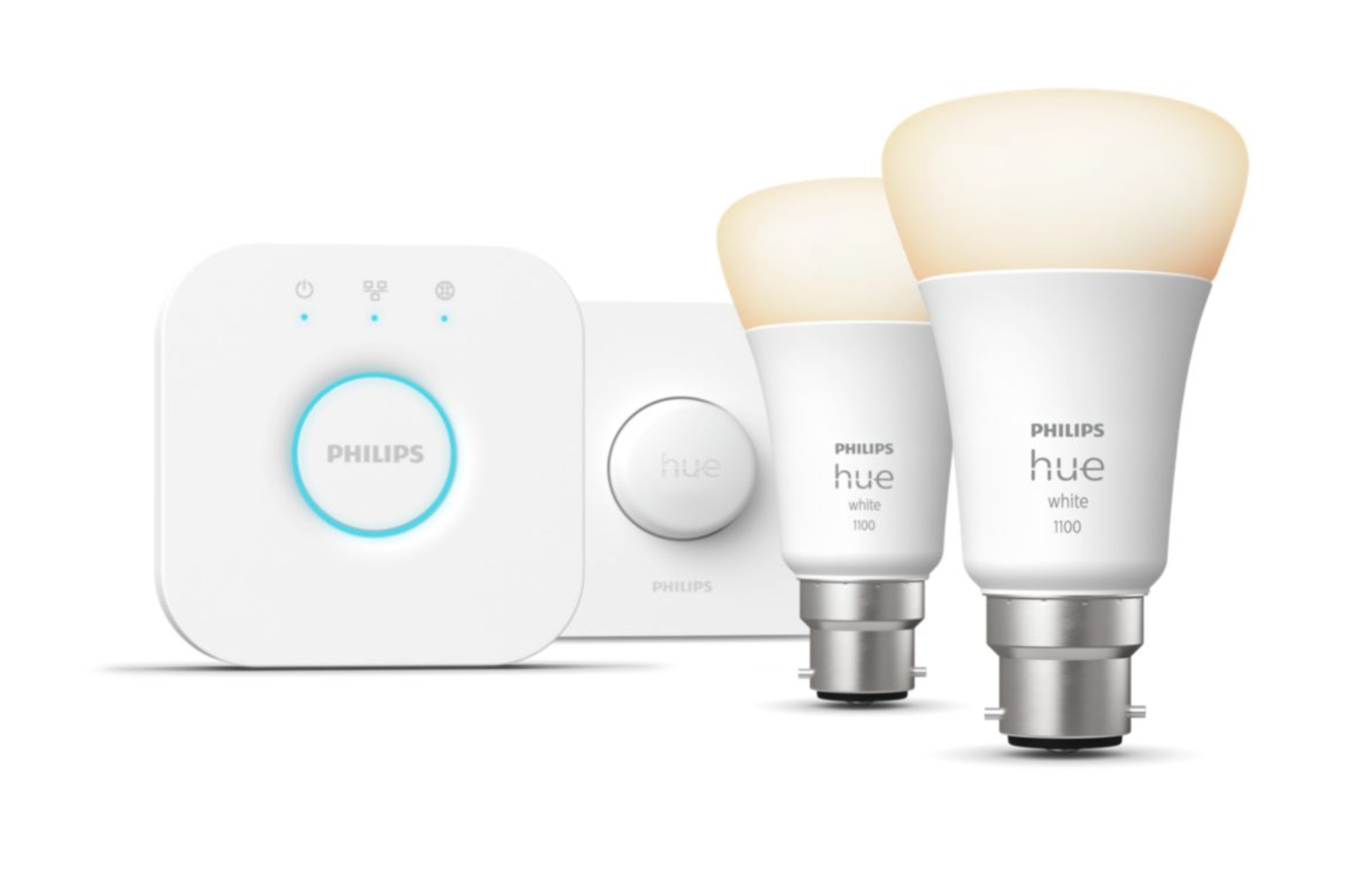
Equally important to consistent printing results is lighting. Just like tip 1, if you're processing or printing your images with room lights that are too warm (or cool), there's a strong possibility that your images will suffer from colour-casts. Therefore, consider replacing your room bulbs with daylight bulbs for a more balanced light. Again , I appreciate this may not be convenient if you use the room for other purposes, too. In this case, you might consider purchasing LED bulbs whose ambience can be changed from warm through neutral to cold by a flick of a switch or via a phone app. These come in many forms but my favourites are the Philips Hue system. These bulbs simply replace your existing bulbs in your room with little effort.
If you're editing during the day, be sure the light-source from your window is also neutral. On winter days for instance, sunlight can be quite warm (in colour temperature) when it flows through your window, so consider using black-out blinds and editing with neutral bulbs as mentioned above if necessary.
3. Calibrate your screen
When your computer screen or monitor leaves the factory, the colour, contrast and brightness are usually set way too high (the cynic in me thinks this is so they stand out from their competitors on a shop floor). This is far from ideal because a). it's very likely that your prints will not match the image colour and/or brightness as seen onscreen and b). neither the colour or brightness of the screen will conform to the ICC's colour standard.
The ICC (International Colour Consortium) was founded many years ago to create a standard for colour throughout the digital/print industry. After years of studies and testing of people around the world, they came up with a colour chart which they added numeric values to (In a nutshell - I'm very much abbreviating here as I'm conscious that I don't want you to fall asleep - colour standardisation is a very deep subject).
What is important for us to know is that if we have a screen that has been ICC calibrated it allows us to process and print our own images (or send them to a printing lab) and get results much closer to that onscreen than you would with a non-calibrated screen.
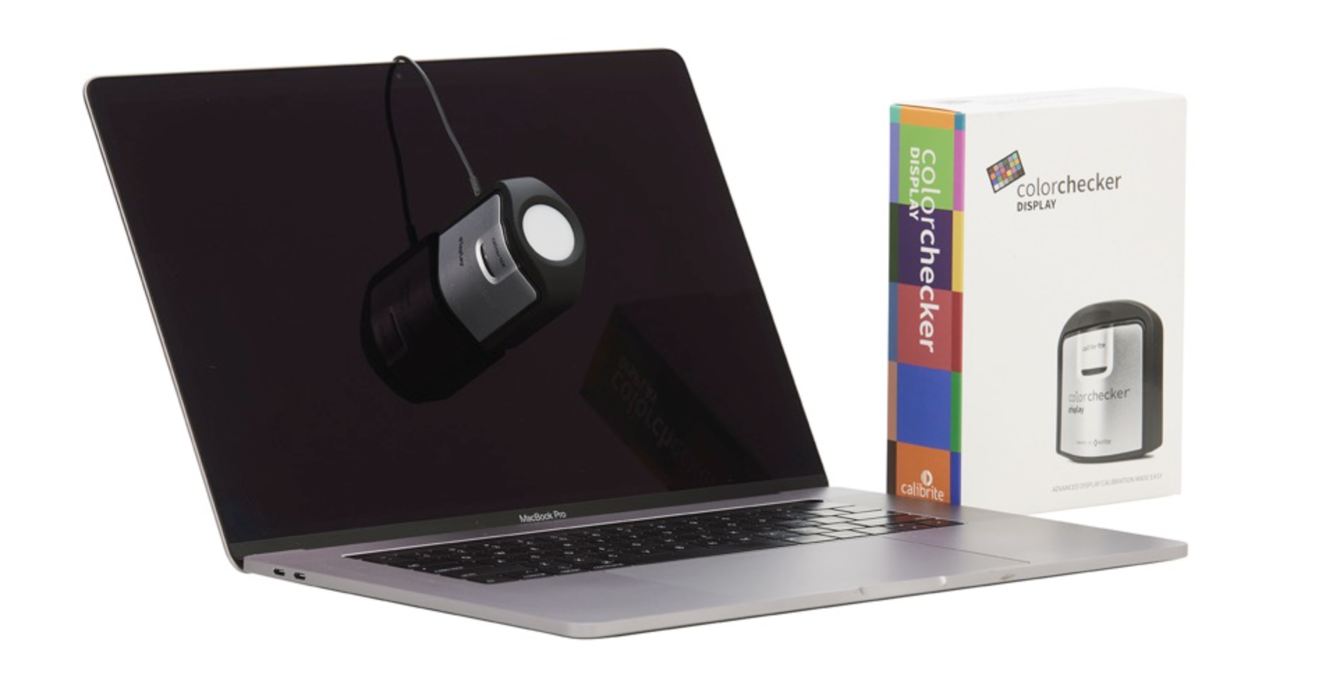
Calibraters come in a variety of options and price points. The two main brands on the market are Calibrite (formerly X-Rite), which I use and Datacolor. Both are very good. For those who use the latest Apple laptops and displays with HDR screens (and especially if you're running the Ventura OS or later), you will need to pay special attention to the product you buy in order for the calibrator to work correctly. I'd be happy to help with further information if you contact me direct at
4. Use a white background

Whatever software you use to process your images, it's important to use a white background when editing. This way, it's easier to reference the white points of your image and easier to tell if your image is under or over exposed. Lightroom Classic (the software I use for editing) defaults to a light grey colour. To change this, right click on the background in the Develop module and select white from the options.
5. Softproof your images
In a nutshell, softproofing means to 'convert' the image you see onscreen (which relies on transmitted light only) to that seen in print (which solely relies on reflected light). To help with this process, we use ICC paper profiles; software which mimics the paper you wish to print onto using appropriate image editing packages such as those from Adobe (Lightroom Classic, Photoshop etc.), On 1 (Capture One), Affinity and so on. Most quality paper manufacturers offer free ICC profiles which you can download from their website. Some even offer to create bespoke profiles especially for your printer and ink set up. Some calibrators even offer the ability to create your own profiles (my preferred solution). Softproofing is an art in itself and once you learn the fundamentals you will find you'll start to get consistent results time and again. I run a variety of printing and hybrid workshops throughout the year which cover softproofing in detail. Please check the Workshops page of my website for my latest workshops program.
As you can see, there are many facets to perfect printing but if you're serious in printing to the highest quality, then following the steps outlined above will get you well on your way! In my 2nd instalment (published here soon), I'll outline another of my 5 top tips for perfect printing - watch this space!